Beyond words: the impact of visual content in copywriting

- 01 March 2024
Who knew when Instagram launched in 2010 it would garner 1 million users just two months later? Today, it boasts over a billion. The meteoric rise of Instagram is just one example of the magnetic pull of visual content. It's not just about photos - it's also about the stories, moments, and emotions captured.
Yet, while Instagram is primarily a photo platform, that little bit of text below can connect audiences with deeper narratives and even drive engagement through calls to action, hashtags, and compelling storytelling.
A quick Google search shows how valued captions actually are. There are millions of results like 300+ Best Instagram Captions for Your Selfies in 2024, and 101 Best Winter Instagram Captions for the Chilly Months.
Visual content and text each have strengths that become even more powerful when combined. So, let's explore the symbiotic relationship between visuals and text and how the right imagery can elevate your narrative.
The science behind visual perception
Our brains are primed to process visual information with exceptional speed and efficiency. We process visuals 60,000 times faster than text. That means that in our digital age, where attention spans are ever-decreasing, visuals offer a quick way to communicate complex messages.
Tweets with images receive 150% more retweets than those without, suggesting that visual content dramatically boosts engagement even on platforms traditionally dominated by text.
Now, you're not here for a biology lesson, but it's worth noting that we're hardwired to image processing, and that’s partially down to our waning attention spans.
We can trace this propensity to our evolutionary history, where rapid interpretation of visual cues was crucial for survival - detecting predators, finding food, or navigating environments. While we're unlikely to encounter any sabre-tooth tigers while popping down to Tesco, we're still hardwired to think like that.
Half of the human brain is involved in visual processing, and although we have five senses, 70% of our sensory receptors are in our eyes. Our eyes are so good that it only takes us 1/10 of a second to make sense of a visual scene.
The integration of visuals in advertising and copywriting
The integration of visuals in advertising and copywriting has a rich history that has evolved with technological advancements and changing consumer behaviours.
The earliest advertisements in newspapers and magazines were text-heavy. However, with improvements in printing technology, visuals emerged. Brands incorporated hand-drawn illustrations to make their ads stand out.
Pears Soap provides a classic example of newspaper advertising from the late 19th century, which included detailed, picturesque illustrations.
Post-WWII saw a boom in consumerism. Television became a household staple, paving the way for commercials. Advertisers began to understand the power of combining visuals with compelling narratives - iconic campaigns like those for Coca-Cola leveraged imagery and catchy jingles to build brand identity.
The advent of the Internet ushered in new advertising opportunities. Banners and pop-up ads became prevalent. However, they were often criticised for being intrusive. This period saw the beginnings of integrating visuals into a digital copy, emphasising user experience.
With the rise of social media and video-heavy platforms, brands began prioritising visually appealing content that could be shared virally. High-quality images, infographics, and video clips became the norm.
Remember when the internet became obsessed with cats? While this advert from Fiskers is classed as advertorial content (rather than a straight-up ad), it's one of my favourite examples. To date, it's racked up over 20 million views.
Moving on from our beloved feline friends, augmented reality (AR) and virtual reality (VR) are opening new frontiers. Advertisements are no longer passive; they're highly visual, interactive experiences that engage consumers in novel ways.
Practical tips for melding visuals with copy
From aesthetic alignment and thematic consistency to the subtleties of visual psychology and narrative coherence, there are many aspects to consider when harmonising visuals with copy. However, here are some essential tips to incorporate into everyday projects.
Work closely with the designer
Consultation between copywriters and designers at the onset of a project is crucial. Copywriters bring an understanding of tone, voice, and narrative structure, which can significantly influence design choices. Conversely, designers offer insights into visual trends, user experience, and the emotional impact of various design elements. Early discussions can highlight potential challenges and opportunities, allowing for a more integrated approach.
Kick-start things by swapping sources of inspiration. Copywriters should consider what's suitable for visualisation and what's not. For example, an infographic might help if there are facts and figures to convey. While the designer will likely have their ideas, giving them some starting points can be helpful.
Align visuals with brand identity and messaging
Aligning visual elements with brand identity and messaging is vital for a few reasons.
First, it creates a cohesive and recognisable brand image - essential for building brand awareness and recall in a cluttered market. When visuals consistently reflect the brand's identity and core messages, they reinforce its values and personality, helping to establish a solid emotional connection with the audience.
Furthermore, consistent visual branding across all platforms and touchpoints enhances credibility and trustworthiness, key factors in consumer decision-making. Brand guidelines are a typical place to start with this.
 Known for its minimalist design and clean aesthetics, Apple's brand guidelines emphasise simplicity, innovation, and usability.
Understanding the target audience is also crucial. Tailor your visuals to resonate with their preferences and cultural contexts. Furthermore, ensure that the visuals reinforce your messaging. Every visual element should serve a purpose: to evoke emotion, highlight a key message, or guide the viewer's attention. Consistency across platforms and materials is critical to building brand recognition and trust.
Balance between text and imagery
Avoid overcrowding. Too much text or overly complex visuals can overwhelm your audience. Aim for a balance that captures attention without causing confusion.
Let the visual and text complement rather than repeat each other. Use visuals to illustrate or emphasise points made in your copy.
Consider hierarchy and emphasis
Visual hierarchy refers to how visual elements are arranged and presented to influence the order in which the human eye perceives what it sees.
This concept is especially crucial in advertising because it guides viewers through the ad in a way that ensures they receive the message as intended. Effective use of visual hierarchy makes an advertisement more engaging and memorable. Canva explains more in this guide.
Use high-quality visuals
While many websites have exceptional brand messaging, poor visuals can let them down.
Quality matters, especially in today's competitive landscape. Use high-resolution images and professionally designed graphics. Poor-quality visuals can undermine even the best copy.
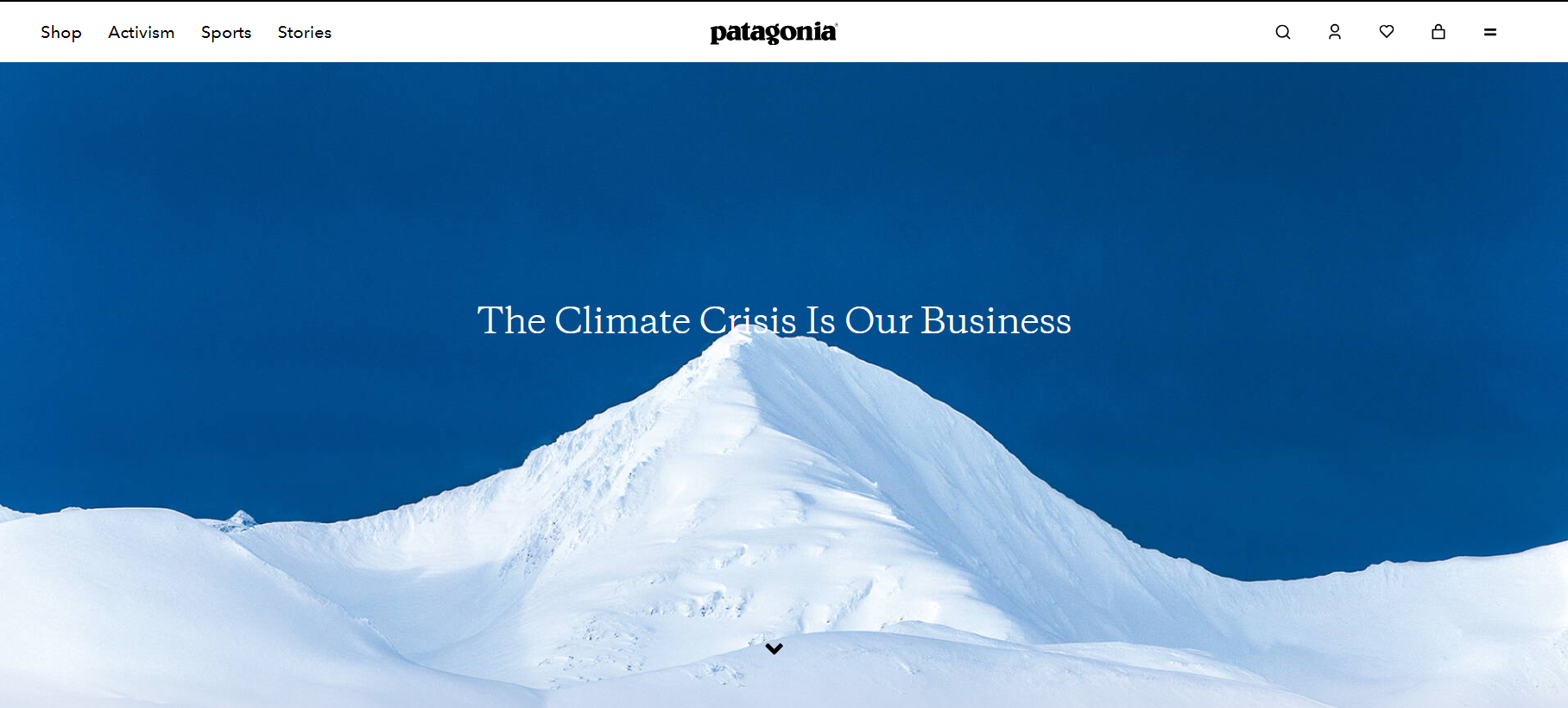
 Known for its environmental activism, Patagonia uses striking natural imagery in its campaigns, accompanied by succinct, powerful messages about conservation and sustainability. The visuals capture the beauty of nature that the brand is committed to protecting, while the text succinctly conveys its mission, creating a robust and cohesive message about its values.
Keep it simple
Simplicity is key, and that applies to both copy and imagery. Avoid using overly complex language or complicated visuals that could detract from your main message.
Your copy and visuals should quickly convey your message without requiring too much effort from the viewer.
Don't overlook accessibility
Web accessibility allows all visitors to use a website regardless of their abilities. Unfortunately, there are still lots of websites that need to comply with best practices.
To make your website accessible, ensure it's inclusive for everyone, including details like alt text for images and easily readable fonts and colours for text.
Final thoughts
Visuals are a powerful tool in the modern marketer's toolkit, and you don't need to be a neuroscientist to learn how to harness their potential to captivate audiences, communicate more efficiently, and create lasting impressions in the minds of consumers.
The most important thing is not to overthink things. Overall, the simpler your visuals and message, the more likely the reader will engage with and remember it.
As the saying goes: "a picture is worth a thousand words", and there's a lot of truth in that.
Ready to Elevate Your Copywriting Skills? CIM’s Digital Copywriting for Social & Content training course can help! Whether you’re crafting Facebook ads, articles, or long-form thought leadership, this one-day course will empower you to create persuasive content that truly resonates. Sharpen your brand voice, generate fresh ideas, and optimize your copy for maximum impact

Tags:
- 0 views

 FAQs
FAQs
 Log in
 MyCIM
MyCIM


